DESIGN SPRINT
Redesigning a donation process for Homework, a charity addressing digital poverty among students.
INFO
UX Researcher UX DesignerRole
5 days Time
Daisy Kyei. Whiteyanne Ideh Weronika Tokaj Team
BRIEF
Homework is a speculative charity that collects used IT devices and distributes them among digitally disadvantaged students.
We have been asked to redesign a donation process to increase the outreach of donors and, as an effect, to help more students in need.
PROCESS
The design sprint is a time-constrained, five-phase process that uses design thinking to reduce the risk when bringing a new product or service to the market. Each day we had certain milestones to accomplish and deliver.
D A Y 2
Sketch
Crazy 8s
Solution Sketch
D A Y 1
Map
Research
HMW Question
D A Y 3
Decide
Storyboard
Final decision
D A Y 5
Test
User Testing
Iterate
DAY 4
Prototype
Wireframe
Prototype

Thanks to our used devices, disadvantaged students can reach their dreams.
DAY ONE MAP
Brief, yet extensive secondary and primary research allowed us to understand the problem space, key target users and factors currently stopping them from donating used devices.
So why aren’t we donating our used devices?
Who are “we”
25% of people in the UK admit to having at least one used IT device. Professionals between 30-40 update devices the most frequently. Only 8% currently consider a donation.
Donors
The real problem
More than 20% of students in the UK are digitally disadvantaged, not having an adequate digital device, this factor severely contributes to educational inequality.
Donees
What stops us
40% of people are not aware of the problem. Others highlight the following reasons:
concern about data security
lack of motivation
lack of time
concerns about who gets a device
Donation process
Our findings revealed that the donation process is unclear to many. This makes us to form a design question
How might we improve the transparency of the tech donation process in order to encourage young professionals to donate their old devices?
DAY TWO SKETCH
Through exploration and initial sketches, we defined our aims and goals. We wanted to design a donation process to be:
1.
transparent
data securitywhere the donation goeswhat it takes to make a donation
2.
straightforward
quickeasy
3.
engaging
user has a say whom his donation benefits
We decided on our deliverables and developed a website with an engaging landing page and an easy-to-follow donation process.
DAY THREE DECIDE
We focused on the bigger picture and designed how the whole donation experience should look like. The storyboard helped us to create a process that is ultimately transparent and straightforward.
1. The user gets a new computer 2. he wants to place the old one in the drawer 3. realising how many used devices 4. he already has to check donation sites 5. and steps upon Homework 6. he reminds himself that while studying, he struggled to 7. he selects the student from the same faculty he graduated from 8. a few days later the box arrives, the user packs the old device.
DAY FOUR PROTOTYPE
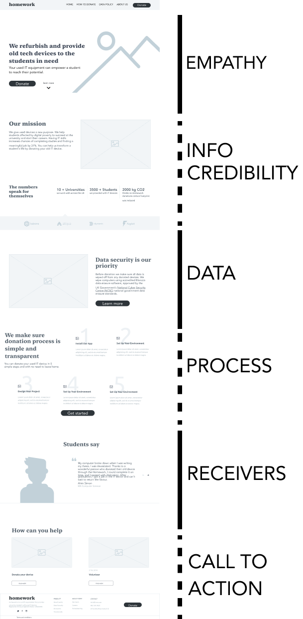
Knowing the deliverables and the donation process, we approached designing wireframes.
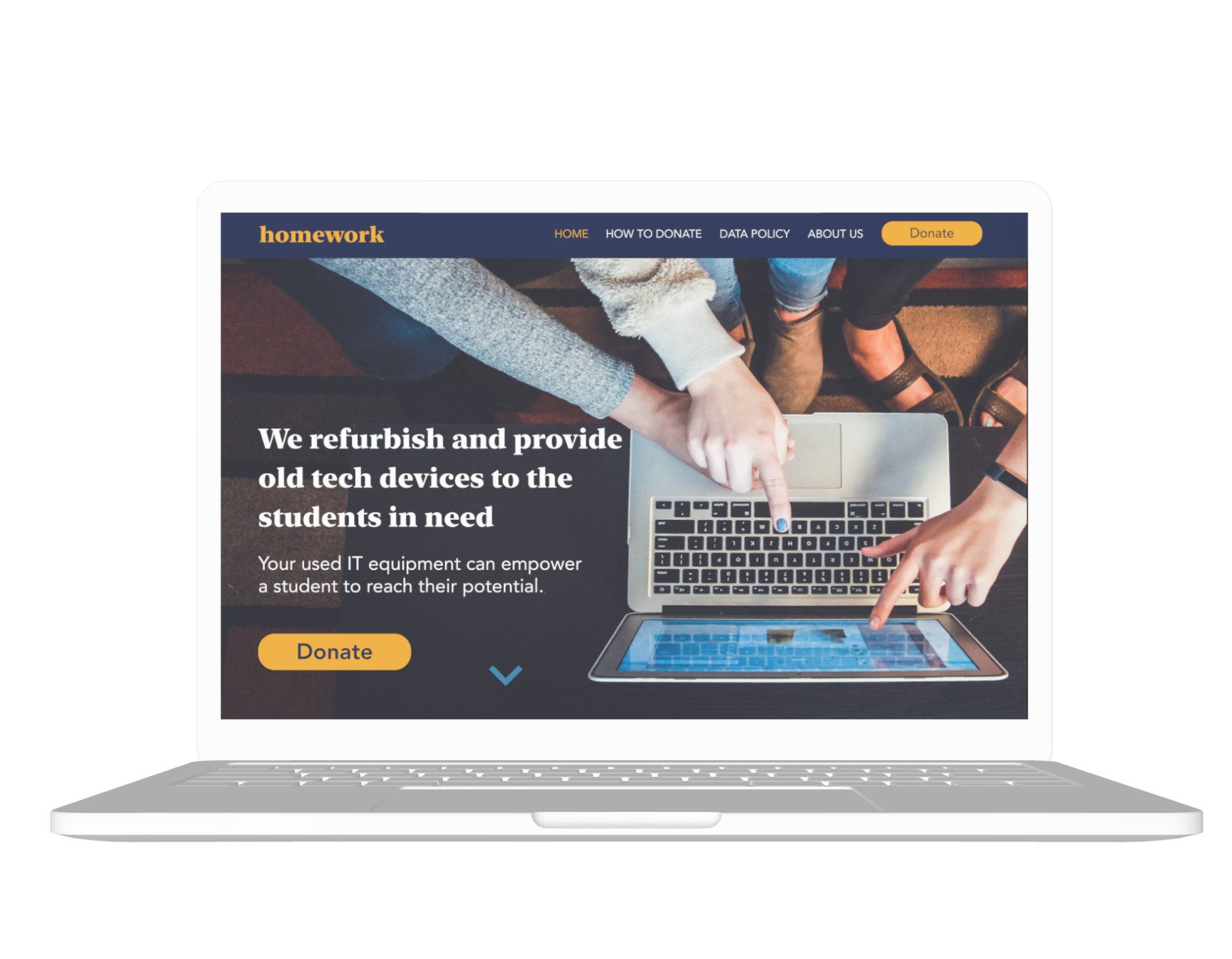
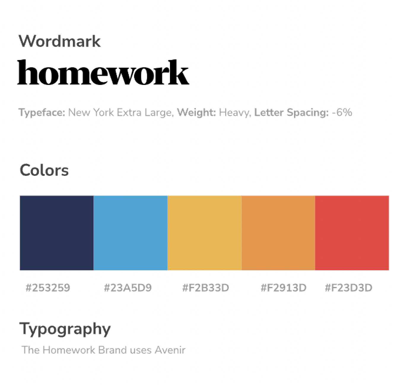
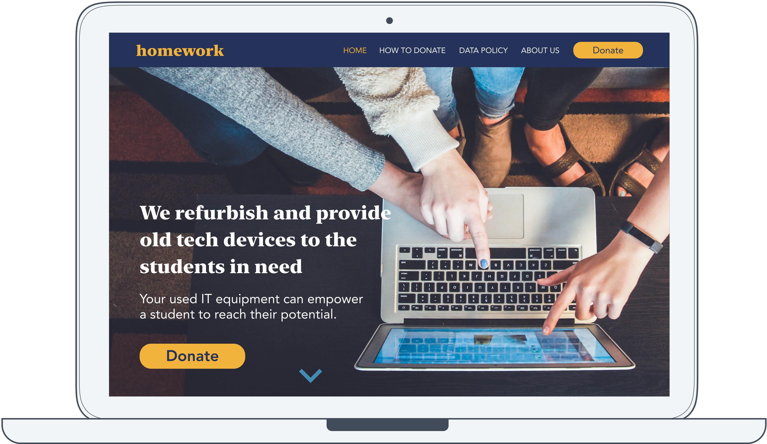
On a canvas of Homework’s existing branding (typography, colour palette) we designed a totally new, animated landing page with the simply explained problem, impact and the donation process.
homepage
donation process
DAY FIVE TEST
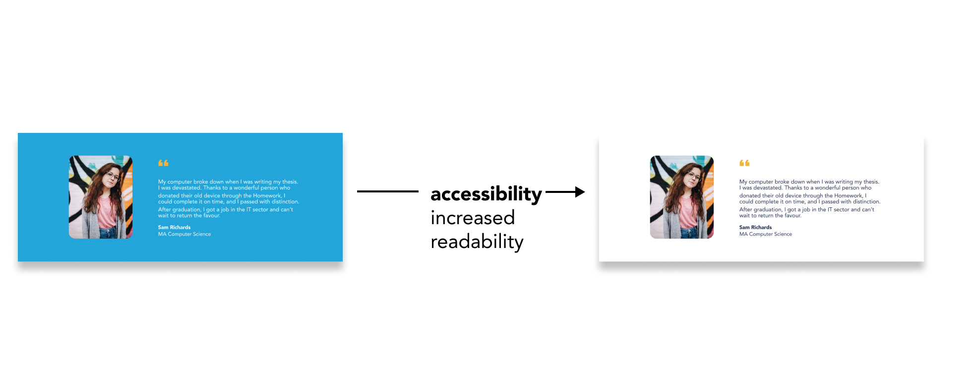
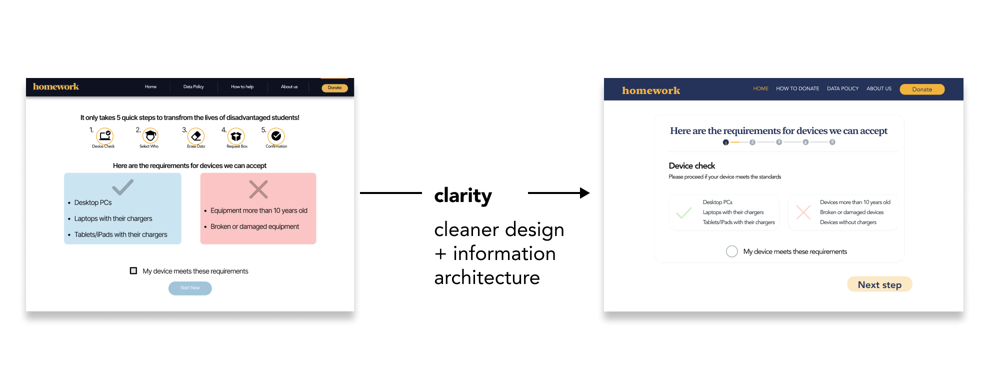
We tested the donation process with five users through a usability test, giving them a task to complete: to donate a used laptop to a medical student. All participants completed the task, and very much enjoyed the process. Some had a few valid but rather minor concerns, which we included in the iterated version.
FINAL THOUGHTS
Designing a website is so much more than designing a website.
Design thinking is such a crazy ride - from not knowing much about the problem space, we could understand it well enough to see the place for improvement. And then develop and validate a design solution — all in 5 days. Although the design was not 100%, we were able to create a service that addresses the issues stopping users from donations.
Dream big design realistically.
While designing for a charitable cause, there is an urge to “solve the problem”; however, it is vital to stay realistic. The design solution will not drastically eliminate the bigger problem; it can help to decrease it, which is a success. Realistic KPIs are essential to be effective.


